Right on Kew
Client: Apo
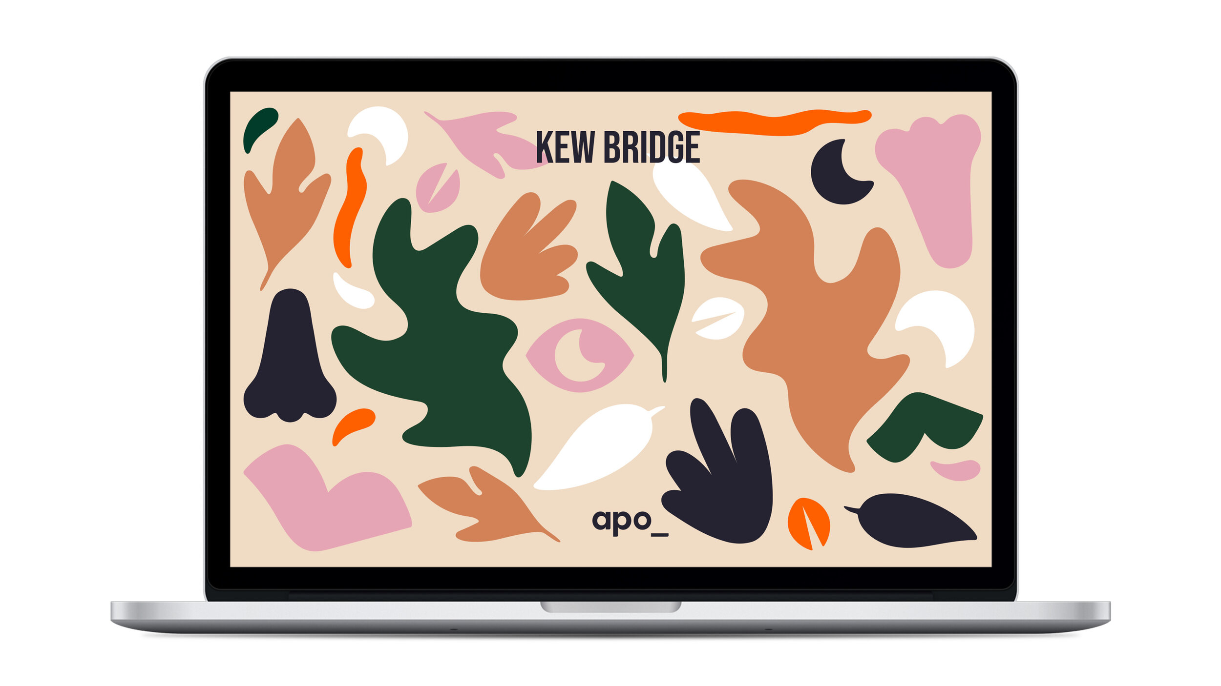
A localised campaign identity for a new living development in Kew Bridge. With community at the heart Apo aims to give better living experiences for Londoners.




Shoal
Shoal is a new sustainable savings accounts. With transparency at the forefront Shoal gives savers the choice to back sustainable projects across the world. Attracting a millennial and gen-z audience who want to build a more sustainable future.


Unlocking potential, building communities
A B-2-B brand identity launching re:shape; property investors with a focus on building urban mixed-use spaces for long-term communities.


Science meets beauty
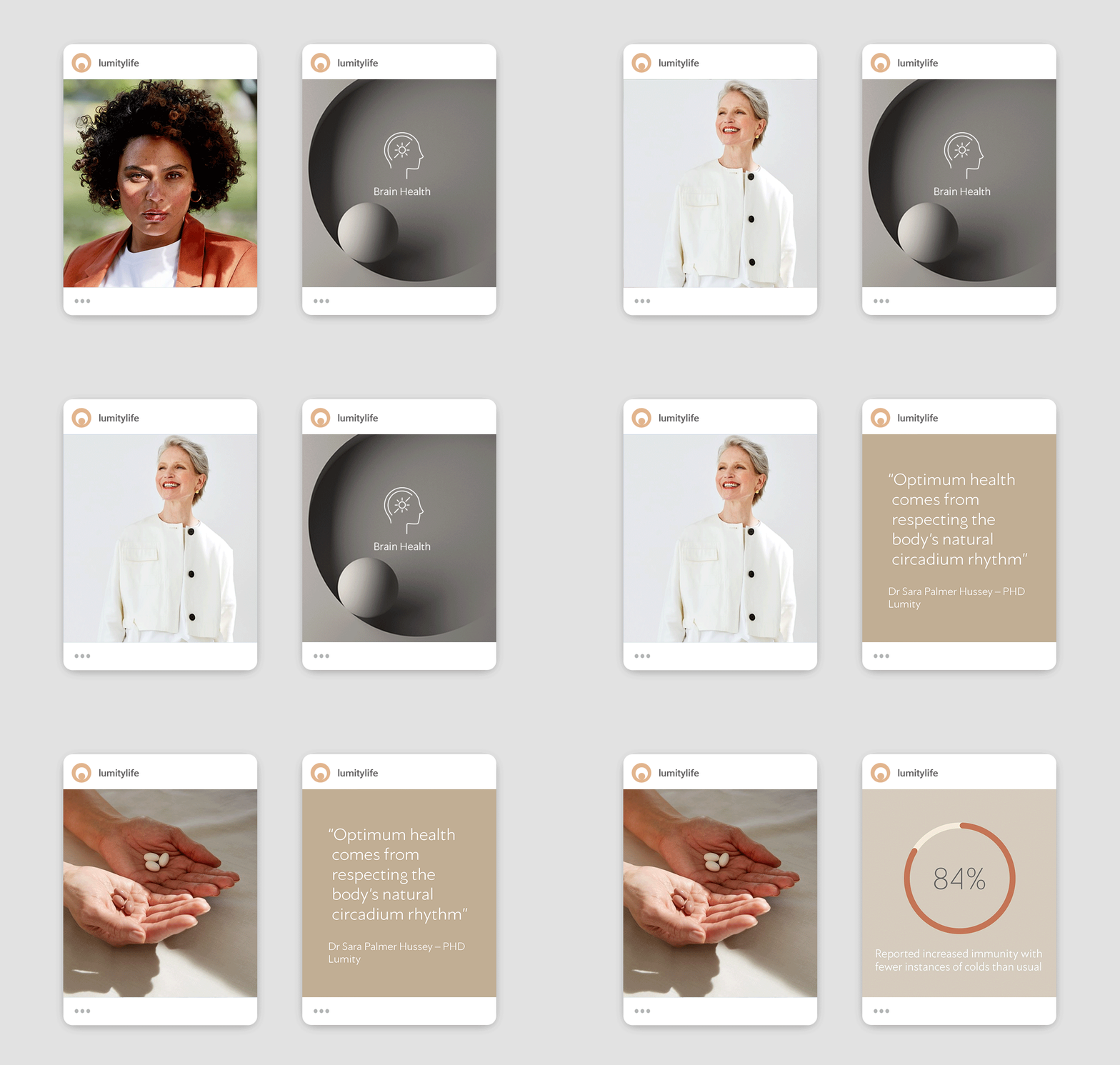
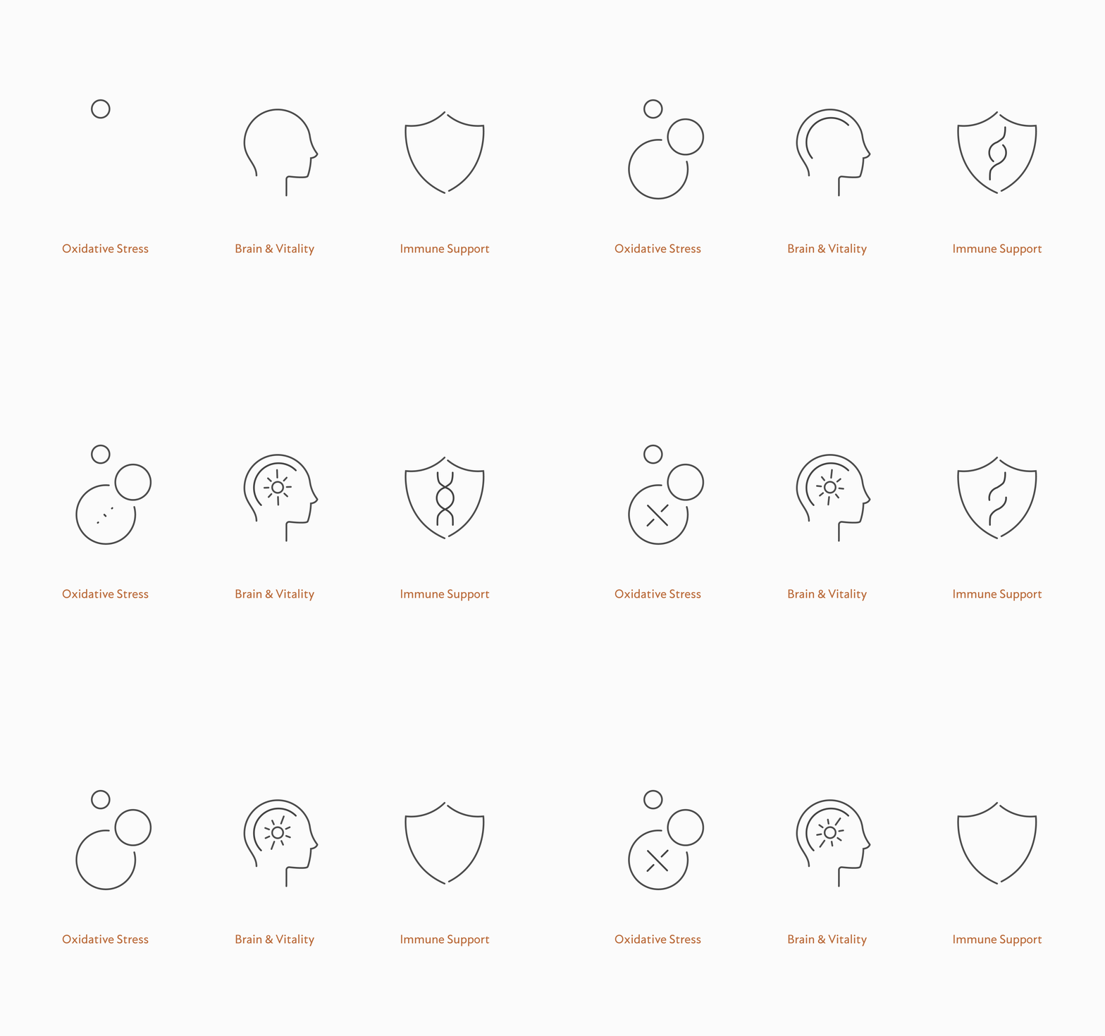
Lumity is a supplement clinically proven to work with your body’s natural rhythm. It works around the clock to stimulate the body’s defences that decline as you age, repairing, restoring and sustaining youthfulness at a cellular level. Helping you to feel and look your best, aid sleep and improve brain function.
Best Visual Identity in Healthcare & Pharmaceuticals
– Transform Awards 2020



A place to call home
Home to more that 11,000 students, across 17 university towns Student Roost brings affordable living with a warm welcome. Changing the game in student property Roost focuses on service and smarter student living for the next generation.
A flexible, location-based system illustrates a broad property portfolio from private flats to shared halls.
Best Graphics – 2018 Creative Pool Awards
Best Visual Identity – 2018 Transform Awards
Best Naming Strategy – 2018 Transform Awards




It’s Simples
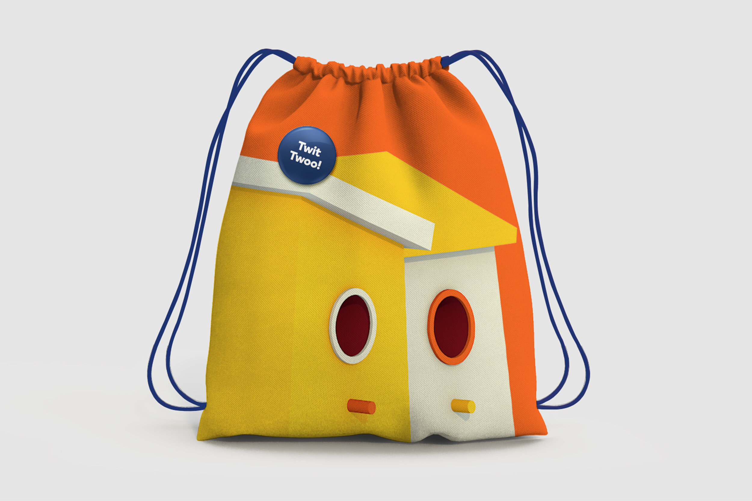
Compare The Market™ owns the most loved mascots on TV. Tasked with creating a more modern and coherent online presence, including a new custom font and CGI brand assets


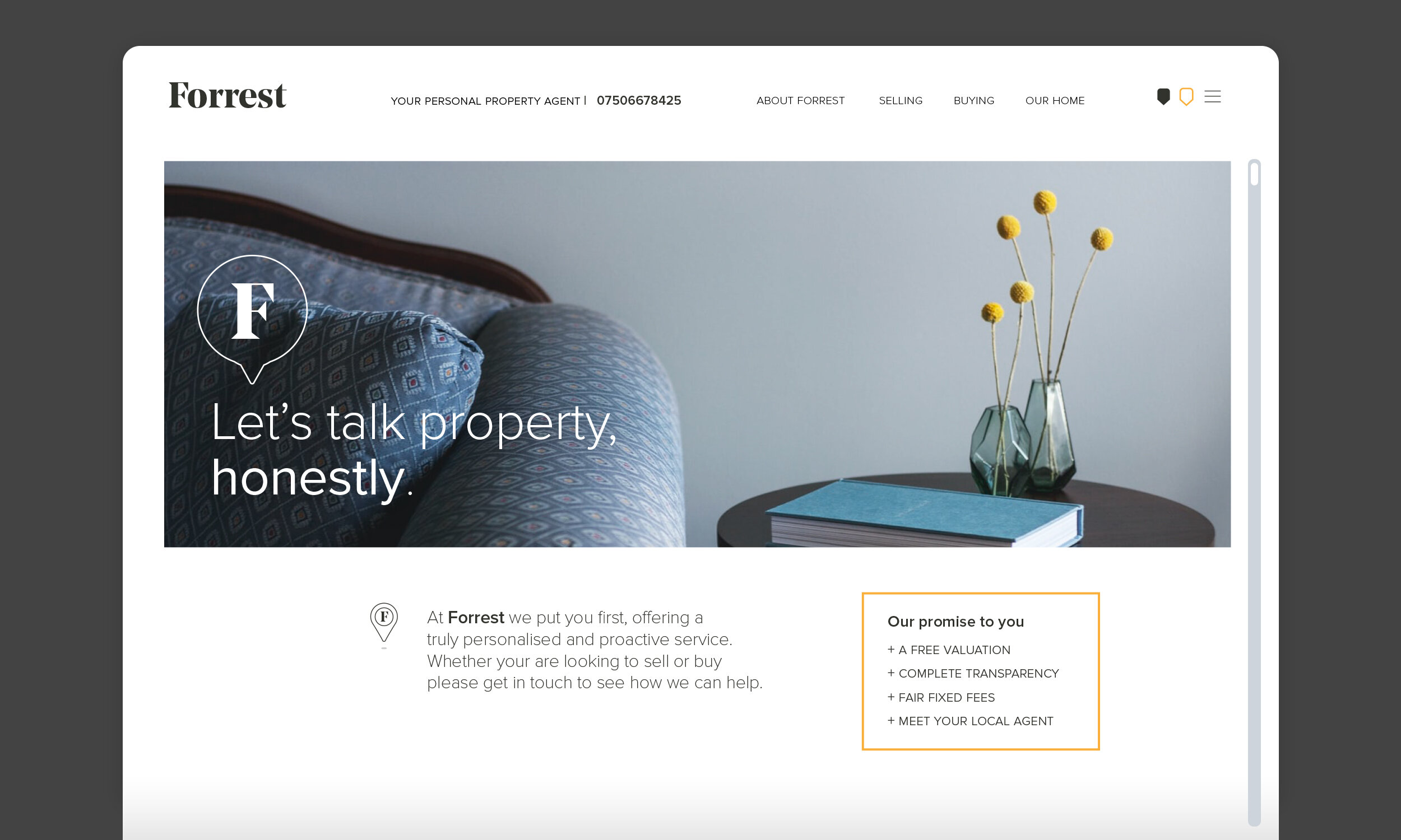
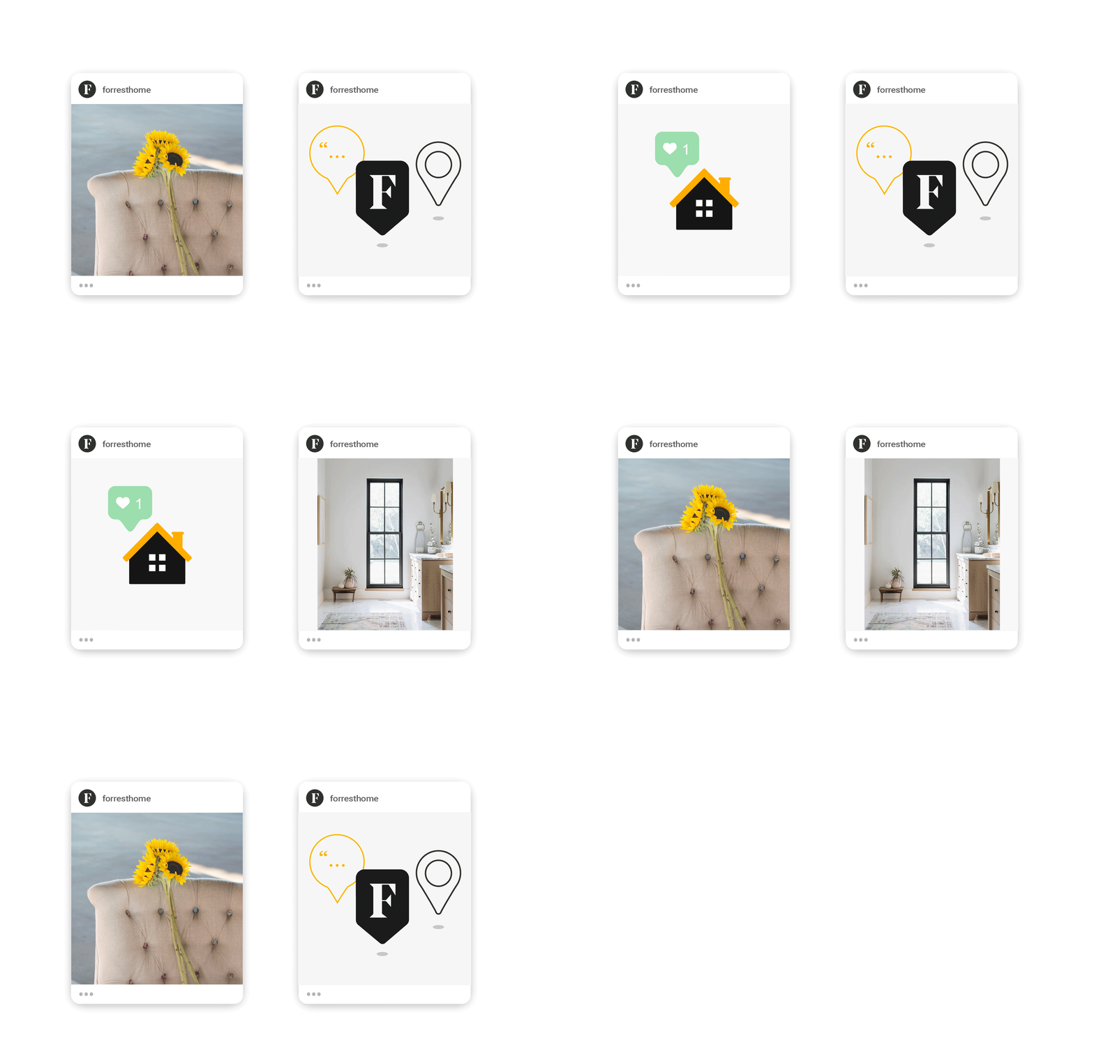
Your personal property agent
Forrest has a committed approach to getting to know you and your property. Offering a more personal service, building relationships on trust and transparency.
